Garry’s startup is seeking to revolutionize the way that contemporary professional training is delivered. By combining face to face seminar training with mobile-friendly modules Shiloh Seminars and Training seeks to nurture the development of new business leaders by cultivating transferable and soft skills. Unlike larger online competitors, Shiloh operates within the Canadian business community, and provides the option for facilitator lead on-site training sessions.
The deliverables I created include:
Business cards
Factsheets
Digital letterhead
Course outlines that could be uploaded to the website and printed off of any printer
A pull-up banner
A table throw
Presentation Folders
Business cards, factsheets, presentation folders in production
BC Adaptive Snowsports is a registered charity dedicated to helping people with physical and/or cognitive disabilities learn to ski. They provide adaptive equipment, train volunteer instructors, and organize ski clubs. As their focus is own helping people get out and have fun, their look needs to feel joyous and welcoming.
The folks at Keith Jack are rightfully proud of the branding and packaging that they have put together over the years. As the third designer to work on their account, it was important that I maintain a respect for the standard of work that they require when handling their brand. In addition to updating their existing files to reproduce properly on the current equipment at their print shop, I have designed a series of new inserts for their latest pieces of jewellery.
In early 2015, Keith Jack Inc. was presented with an award for Best Packaging and Presentation from the North American Celtic Trade Association.
A selection of packaging and display pieces from a recent order.
Travelers Canada is one of the leading New Home Warranty Insurance providers in Western Canada. Every year they thank their customers with gift of a table-top calendar showcasing the work of their industry partners.
Finished calendar opened to the January 2016 page
Printed 2015 calendars waiting to be bound.
All the wire for all the wire binding
2016 calendars waiting to be trimmed down to size
Finished 2015 calendar.
Finished calendar side view.
January 2015 grid
February 2015 grid
March 2015 grid
April 2015 grid
May 2015 grid
June 2015 grid
July 2015 grid
August 2015 grid
September 2015 grid
October 2015 grid
November 2015 grid
December 2015 grid
January 2016 as it appeared in the 14-month 2015 calendar
February 2016 as it appeared in the 14-month 2015 calendar
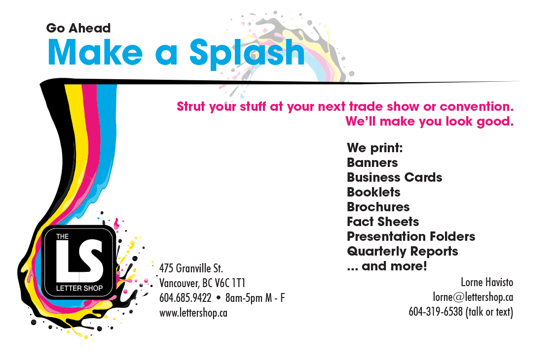
When I started at The Letter Shop, the company had no coherent branding approach, no product list of any sort, and no file submission guidelines. As a large part of my position with the company was tied to prepress and file setup, the latter two became a priority especially since several new employees were on-boarding with me.
Half page ad for the 2014 HRMA Conference Guide featuring the old colour scheme.
What design work had been done was stuck in an outdated approach to selling print that focused just on selling that they could produce full colour prints. So everything was covered in what I’ve affectionately called “CMYK rainbow vomit”, and there was nothing that promoted through its design what the shop specialized in: commercial and financial printing.
I used these to generate a mini project brief for the ongoing process of re-jigging the branding associated with the shop and how we use our own printed products to communicate with customers. Since our main niche was printing for corporations and public companies the goal was to take the existing assets, and switch them up to create an image that was corporate, stable and clean with an emerging emphasis on the shop’s long history in Vancouver.
The deliverables I have been responsible for include:
An updated branding guideline with a new colour scheme, and standardization of the typefaces for printed materials.
A series of rack cards detailing file submission guidelines for our most often ordered items and other information to help customers improve the quality of the products we make from their files.
A half fold brochure detailing our products and services.
Presentation folders.
Two direct mail campaigns with a personalized letter and response pieces.
Jas also does wedding henna and draws her own designs. This was a vector reworking of one of them.
Jas came to the print shop I was working in on the eve of launching her business. She had a very clear idea of what she wanted for her signs. And she wanted glitter and pantone purple. Since she was a skilled mehndi artist, and wanted to eventually expand her business in that direction, the logo I designed for her was based on one of her henna designs.
The deliverables of the finalized design that I was responsible for were:
Logo design and basic branding for print
Business Cards
8.5×11 Brow Bar Menus
Laser-cut vinyl decals in two different sizes for the windows and doors
Sandwich board sign
Hanging backlit vinyl store sign
Mandala logo with text
Backlit hanging sign for Silver Orchid brow bar.
Printed copies of the bar menu and business cards.
Street front of the browbar.
Sandwich board sign.
Window decal before application.
Decals in the windows.
On the door.
Decals
Decal from behind.
Brow bar menu 1.
Brow bar menu 2.
First version of the business card, before the colour was finalized.
Final version of the business card.
Conceptualizing the logo…
Conceptualizing the logo…
Conceptualizing the logo…
Jas also plans to do wedding henna and draws her own designs. This was a vector reworking of one of them.
I then added more petals to make it into a flower.
Took out the centre, replaced it with a “S”, and added the preferred logotype below.
One of the outside salespeople at The Letter Shop wanted to pursue contracts with a number of local area restaurants and asked me to create mockup promotional materials for a fake food truck to put into his proposals.
As part of a business development plan spearheaded by a member of the sales team at The Letter Shop to increase the business that the shop does with local area restaurants, I was asked to create mockup marketing materials for a mid-price point restaurant.