
When I started at The Letter Shop, the company had no coherent branding approach, no product list of any sort, and no file submission guidelines. As a large part of my position with the company was tied to prepress and file setup, the latter two became a priority especially since several new employees were on-boarding with me.
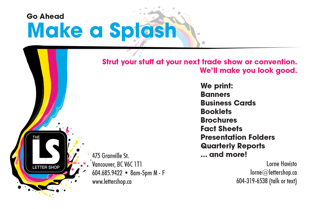
What design work had been done was stuck in an outdated approach to selling print that focused just on selling that they could produce full colour prints. So everything was covered in what I’ve affectionately called “CMYK rainbow vomit”, and there was nothing that promoted through its design what the shop specialized in: commercial and financial printing.
I used these to generate a mini project brief for the ongoing process of re-jigging the branding associated with the shop and how we use our own printed products to communicate with customers. Since our main niche was printing for corporations and public companies the goal was to take the existing assets, and switch them up to create an image that was corporate, stable and clean with an emerging emphasis on the shop’s long history in Vancouver.
The deliverables I have been responsible for include:
- An updated branding guideline with a new colour scheme, and standardization of the typefaces for printed materials.
- A series of rack cards detailing file submission guidelines for our most often ordered items and other information to help customers improve the quality of the products we make from their files.
- A half fold brochure detailing our products and services.
- Presentation folders.
- Two direct mail campaigns with a personalized letter and response pieces.
- Printed magazine ads.
- Banner ads.
- Calendars


